
How Paint Choices Impact Mood and Atmosphere?

The paint colors we choose for our living spaces have a significant influence beyond aesthetics. Hues have many subtle yet powerful psychological associations that can affect our moods and experiences.
Warmer tones like yellows and oranges tend to promote feelings of optimism, energy, and concentration. Meanwhile cooler blues and greens often provide a calming, soothing atmosphere.
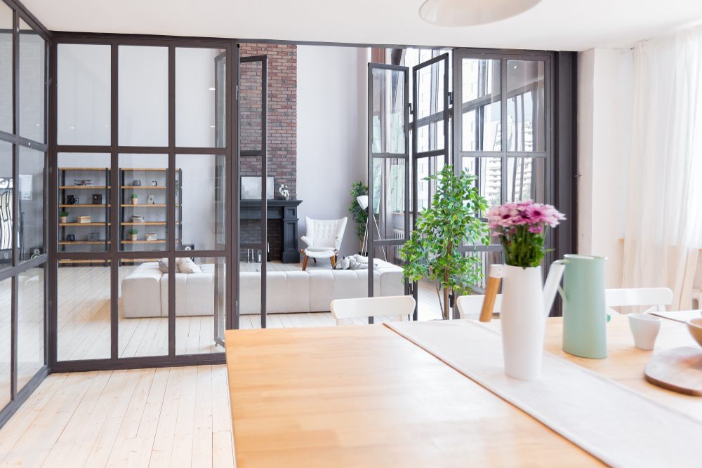
Neutrals permit furnishings and decor to stand out while bolder accent walls add visual interest. Even the undertones in paint, whether red, blue, or yellow, impact perceptions. Factors like sheen, lightness, and darkness also alter vibes.
By understanding these influential but nuanced paint properties, individuals can select palettes tailoring spaces to desired functions and emotional impacts.
Reasons about How Paint Choices Impact Mood and Atmosphere
Here are some reasons you need to know:
-
Color Psychology:
-
Light Reflection:
-
Room Size Perception:
-
Personal Preference:
-
Complementary Elements:
One primary way paint choices affect ambiance is through established associations in color psychology. Extensive research has found that certain hues evoke innate responses corresponding to emotions.
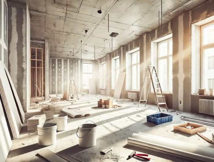
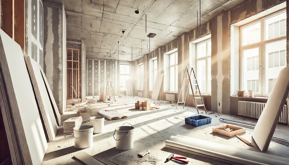
For example, warmer tones like yellow and red stir stimulation, while cooler blues bring calmness. These rooted reactions are why colors are essential in interior renovation Dubai design schemes to create specific environments.
Attention to probable psychological effects allows homeowners to apply colors strategically that enhance intended functions. For example, living room paint might energize conversations, whereas bedroom tones might facilitate relaxation. Harnessing color science optimizes emotional impacts.
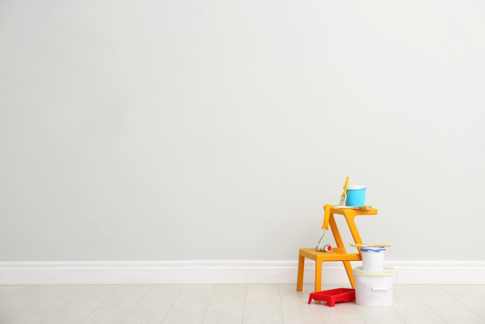
How a paint color reflects and absorbs light influences subjective perceptions. Lighter hues bounce more light around a space, visually and psychologically energizing the environment. This makes them popular for rooms where upbeat energy is desired, like kitchens.
Darker colors soak up light, which can induce feelings of coziness. Painting services may suggest darker options for smaller rooms to avoid an oppressive effect. The tint also plays a role, as vivid tones reflect light dramatically, while muted shades absorb more.
Carefully considering a paint’s light reflective qualities enables homeowners to stylize spaces with the intended luminous character and ambiance.
The paint hue selected can often influence the perceived size of a room’s space. Lighter, brighter colors generally make an area feel more expansive and airy by bouncing light around.
They visually enlarge dimensions. In contrast, darker paints may cause smaller rooms to feel cramped as they absorb light. For example, a dark living room risks appearing boxed in. Painting walls a light shade and applying it to all surfaces, including trim and ceilings, creates an enveloping effect that broadens the scope.
Color psychology also indicates that darker tones correspond with coziness rather than vastness. By understanding these scale-altering properties of different paint choices, homeowners can maximize usable rooms.
While there are established theories about how colors psychologically influence moods, individuals also have personal aesthetic tastes that shape their design decisions.
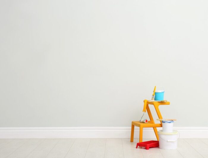
Paint selection is inherently subjective based on life experiences and innate predispositions. What energizes one person may relax another. Memory and culture color perceptions, too. With client input, interior designers pair preferred hues with expert guidance on probable effects to satisfy emotion and function.
Self-expression through favored shades tailored to routines helps optimize the atmosphere. Testing sample colors allows homeowners to visually experience different vibes to identify the perfect fit for their distinctive personality. Personal paint preference ensures the optimum blend of joy, comfort, and self-identity.
The paint color chosen for a room should be considered in the context of the other elements occupying the space. Bold hues may clash with calming furnishings or artwork.
Neutral paint permits flexibility in decor changes. Monochromatic palettes tie a space together cohesively while accent colors highlight features. Complementary textiles, lighting warmth and hardware finishes also influence the atmosphere a shade implies.
An orange wall demands contrasting blues while soft greens require complementary taupe and rose tones. Colors that appear harmonious together across materials ensure an integrated atmosphere aligned with the intended vibes. Evaluating complete looks helps select optimally unifying paints.


Frequently Asked Questions
-
How do warm paint colors impact mood?
-
How do cool paint colors impact mood?
-
How does the lightness or darkness of the paint impact mood?
-
How do paint undertones impact mood?
Warmer paint colors like yellows, oranges, and reds have been shown to promote feelings of optimism, energy, and concentration. The heat and vibrancy of warm tones visually stimulate our perception of ambient temperatures, triggering corresponding psychological responses linked to enthusiasm and focus.
Cooler paint colors, such as blues and greens, are frequently said to induce calming and soothing atmospheres. These hues’ cooler impressions visually imply colder surroundings that signal rest and relief to our brains, easing stress, tension, and anxieties with associated impacts on mood and disposition.
Lighter, brighter paint colors tend to energize and exhilarate our moods through symbolic associations with sunshine, daylight clarity, and enthusiasm. Darker, more muted colors often correlate with relaxed, peaceful effects aligning with nightfall, coziness, and rest. Lightness can inspire, while darkness may tranquilize our emotional responses.
Even subtle undertones of red, blue, or yellow in paint colors can skew the psychological influence, slightly intensifying or altering the critical effect. Reds propose warmth and vigor, while blues suggest calm. Yellow undertones balance the two when optimization of multiple mood attributes is desirable. Undertones fine-tune a paint’s dynamic impact.
Conclusion
In conclusion, the paint hues we choose for our living and work environments affect us more profoundly than we often realize. Whether we want an energizing, focused atmosphere or a tranquil, peaceful ambiance, paint colors deliver tangible psychological outcomes.
While individual responses vary, specific color theories remain consistently supported by research. By thoughtfully considering these influence factors during the selection process, from sampling different options to final application, we can leverage the power of paint to shape surroundings optimally to suit our intended purposes and well-being needs.
A little forethought in the palette makes a big difference in emotional impact.